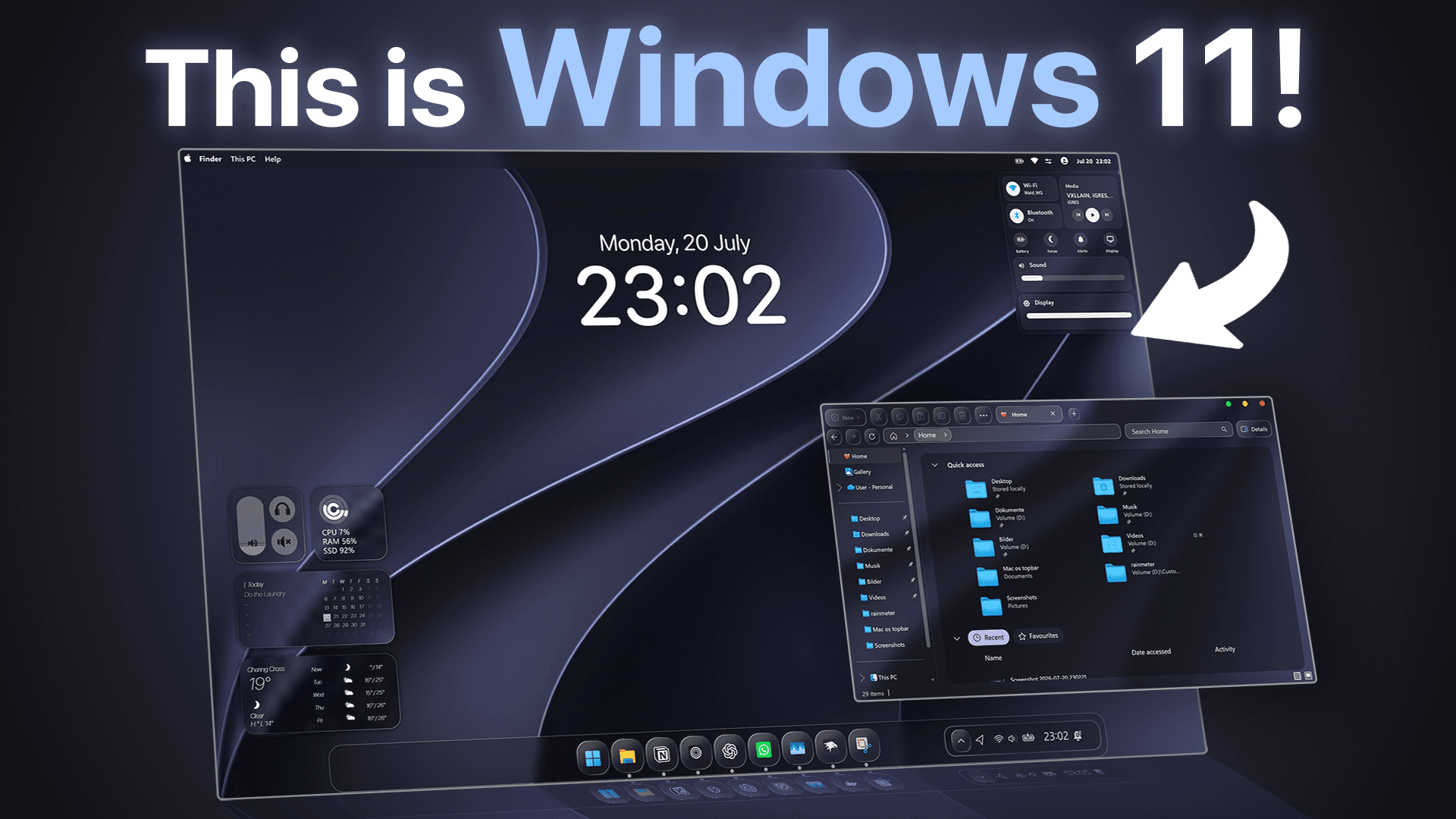
Windows 11 can be customized a lot more than Microsoft wants you to believe. In this setup, we are turning Windows 11 into a macOS 27 Golden Gate-inspired desktop using community themes, Windhawk mods, Rainmeter widgets, a custom top bar, and a Spotlight-style launcher.
The goal is not just to change the wallpaper and call it a day. We are changing the parts that actually make Windows look like Windows: the taskbar, Start Menu, notification center, File Explorer, system icons, widgets, top bar, cursor, window buttons, and search experience.
By the end, Windows should feel much closer to a macOS-style desktop while still running as normal Windows underneath.
Downloads and Resources
You can find all setup files, links, themes, and configs here:
Full setup resources:
📥 Download Sports Pulse v1.3.3Main resources used:
- macOS 27 Golden Gate theme: [YOUR LINK]
- Windhawk: [YOUR LINK]
- OS26 Liquid Glass taskbar theme: [YOUR LINK]
- Rainmeter: [YOUR LINK]
- JaxCore: [YOUR LINK]
- Big Sur widgets: [YOUR LINK]
- Spotlight search tool: [YOUR LINK]
Taskbar animation code
{"AnimationType":0,"MaxScale":128,"EffectRadius":0,"SpacingFactor":100,"BounceDelay":500,"FocusDuration":150,"MirrorForTopTaskbar":0,"DisableVerticalBounce":0,"TaskbarLabelsMode":0,"ExcludeSystemButtonsMode":0,"LerpSpeed":100,"DisableBounce":1}Step 1: Install Windhawk
The first tool we need is Windhawk.
Windhawk lets you modify parts of Windows with custom mods and code. For this setup, it is one of the most important tools because it allows us to customize system UI elements that Windows normally does not let us change properly.
We will use it for things like:
- Taskbar styling
- Start Menu styling
- Notification styling
- File Explorer styling
- Transparency adjustments
- Resource Redirect
- macOS-style icons
- Taskbar animations
To install it, download Windhawk from the official website, run the installer, and follow the setup process. Once it opens, we can start adding the mods that will transform the Windows UI.
Step 2: Install the macOS 27 Golden Gate Theme
Next, we need the base visual style.
For this, we use a community-made macOS 27 Golden Gate theme for Windows 11. This theme gives us the main system look, the wallpaper, the cursor, and macOS-style window buttons.
Theme page:
https://www.linkvegastheme.com/macos-27-golden-gate-theme-for-windows-11/
After downloading the theme, extract the files and follow the included installation instructions.
This creates the foundation of the setup. It already pushes Windows toward the macOS 27 Golden Gate look, but the default Windows UI elements still give the setup away pretty quickly.
I also recommend testing an alternative wallpaper if you want an even cleaner final result. The default theme wallpaper works, but a stronger glass-style or Golden Gate-inspired wallpaper can make the whole setup feel more premium.
Step 3: Style the Start Menu and Notification Center
The next things to fix are the Start Menu and notification center.
These are two of the fastest ways Windows exposes itself. Even if the desktop looks good, opening the default Start Menu immediately ruins the illusion.
For this step, install these Windhawk mods:
- Start Menu Styler
- Notification Styler
For both, use a simple transparent or glass-style theme. The goal is not to overcomplicate the design. We just want the Start Menu and notification panel to feel lighter, cleaner, and more consistent with the macOS-inspired setup.
After installing the mods, paste the theme code into the advanced settings of each mod and save it. Restart Explorer if needed.
Once applied, the Start Menu and notification center should blend much better with the rest of the theme.
Step 4: Add the Custom Taskbar Theme
The taskbar is one of the most important parts of the entire setup.
If the taskbar still looks like default Windows, the whole macOS illusion is basically dead. For this setup, we want the taskbar to feel more like a modern floating dock with a liquid glass look.
For this, install the Taskbar Styler mod in Windhawk.
Then use the OS26 Liquid Glass taskbar theme from this GitHub guide:
Copy the theme code, open the Taskbar Styler advanced settings, paste it in, and save.
You can also add extra taskbar mods for:
- Taskbar animations
- Genie-style opening animations
The Genie animation fits the macOS recreation theme, although it is definitely a matter of taste. It is worth trying if you want the setup to feel closer to macOS, but you can skip it if you prefer a cleaner Windows experience.
At this point, the desktop should already look much more like macOS than Windows.
Step 5: Customize File Explorer, Transparency, and Icons
Next, we need to fix File Explorer.
Even if the desktop looks perfect, opening a default Windows Explorer window immediately gives the whole setup away.
For this step, apply a custom File Explorer theme through Windhawk. Then adjust your transparency settings.
Important transparency settings:
- Turn new colors off
- Use a custom exclusion list
- Exclude apps where transparency causes visual bugs
- Avoid making every window fully transparent
The goal is a clean glass effect, not a broken transparent mess where nothing is readable.
After that, use Resource Redirect with macOS Dark Mode icons.
This replaces more Windows-style icons with macOS-inspired icons and makes the system feel much more consistent. Icons are a small detail, but they matter a lot. If the icons look wrong, the entire setup feels less convincing.
Step 6: Install Rainmeter
Now that the main Windows UI is mostly transformed, we can add desktop widgets.
For this, we use Rainmeter.
Rainmeter is still one of the best tools for custom desktop widgets on Windows. It gives you much more control than the default Windows widget panel and is perfect for recreating a macOS-style desktop.
Download Rainmeter from the official website, install it normally, and then you can add widget packs using .rmskin files.
Step 7: Install the Custom macOS Top Bar
One of the most important macOS design elements is the top bar.
Without it, the setup can still look nice, but it does not fully feel like macOS. That is why this setup includes a custom AI-built macOS-style top bar.
The top bar should follow the classic macOS structure.
Left side:
- Apple logo
- Finder
- File
- Edit
- View
- Go
- Window
- Help
Right side:
- Wi-Fi
- Battery
- Volume
- Control Center
- Time and date
This will not behave exactly like the real macOS global menu bar, but visually it makes a huge difference. Once the top bar is installed, the desktop starts feeling much more like an Apple-style system instead of just a Windows theme.
Copy the custom top bar files from the resource pack and follow the included setup instructions.
Step 8: Add the JaxCore macOS Clock
Next, we add a clean macOS-style clock widget with JaxCore.
JaxCore is useful for modern modular widgets and can look cleaner than many old-school Rainmeter skins.
Install JaxCore, add the modular clock, and place it somewhere that fits your wallpaper and desktop layout.
The key here is restraint. The setup should feel clean and premium, not like a spaceship dashboard with too many widgets.
Step 9: Add Big Sur Widgets for Rainmeter
To make the desktop feel more like macOS, we can also add the Big Sur widget pack for Rainmeter.
Big Sur widget pack:
https://www.deviantart.com/fediafedia/art/Big-Sur-26-for-Rainmeter-846882462
Download the widget pack, run the .rmskin file, and install it through Rainmeter.
After installation, choose the widgets you actually want to use and place them cleanly on your desktop.
Do not overload the setup. A few well-placed widgets look much better than filling the entire desktop with random panels.
Step 10: Add a Spotlight-Style Search
The last step is adding a Spotlight-style search experience.
macOS is not only about visuals. Spotlight is a big part of how the system feels to use. Windows Search works, but it does not have the same clean launcher experience.
For this setup, use a Raycast-style search replacement for Windows.
This gives you a cleaner way to:
- Open apps
- Search files
- Launch commands
- Access shortcuts quickly
Set it up with a keyboard shortcut and test app launching and file search. This makes the setup feel more like macOS in actual daily use, not just in screenshots.
Final Result
After all the changes, Windows 11 should look much closer to macOS 27 Golden Gate.
The final setup includes:
- macOS 27 Golden Gate theme
- Alternative Golden Gate-style wallpaper
- Custom cursor
- macOS-style window buttons
- Glass-style taskbar
- Transparent Start Menu
- Transparent notification center
- Custom File Explorer theme
- macOS Dark Mode icons
- Rainmeter widgets
- JaxCore clock
- Big Sur widget pack
- Custom macOS-style top bar
- Spotlight-style search
Of course, it is still Windows underneath. If you go deep enough into the wrong settings page, Windows will expose itself pretty quickly.
But from the desktop view, this setup gives off a surprisingly convincing macOS 27 Golden Gate look.
So now the real question is:
Did we actually turn Windows 11 into macOS 27, or is this still just Windows wearing an Apple costume?
Final Notes
This setup is a good example of how far Windows customization can go with the right tools.
The most important part is consistency. The theme, taskbar, top bar, icons, widgets, transparency, and wallpaper all need to follow the same visual direction. If one part looks completely different, the entire illusion breaks.
That is also why small details like icons, spacing, blur strength, and widget placement matter so much.
If you recreate the setup or improve it, feel free to share your version in the Discord. I would love to see how close the community can push Windows toward macOS 27 Golden Gate.